Client: Site & Strata, Perth – Australia
Problem: Old logo & business cards looked outdated
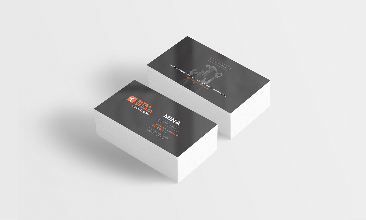
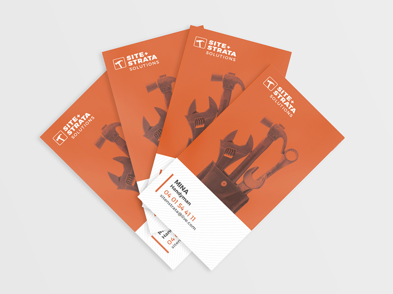
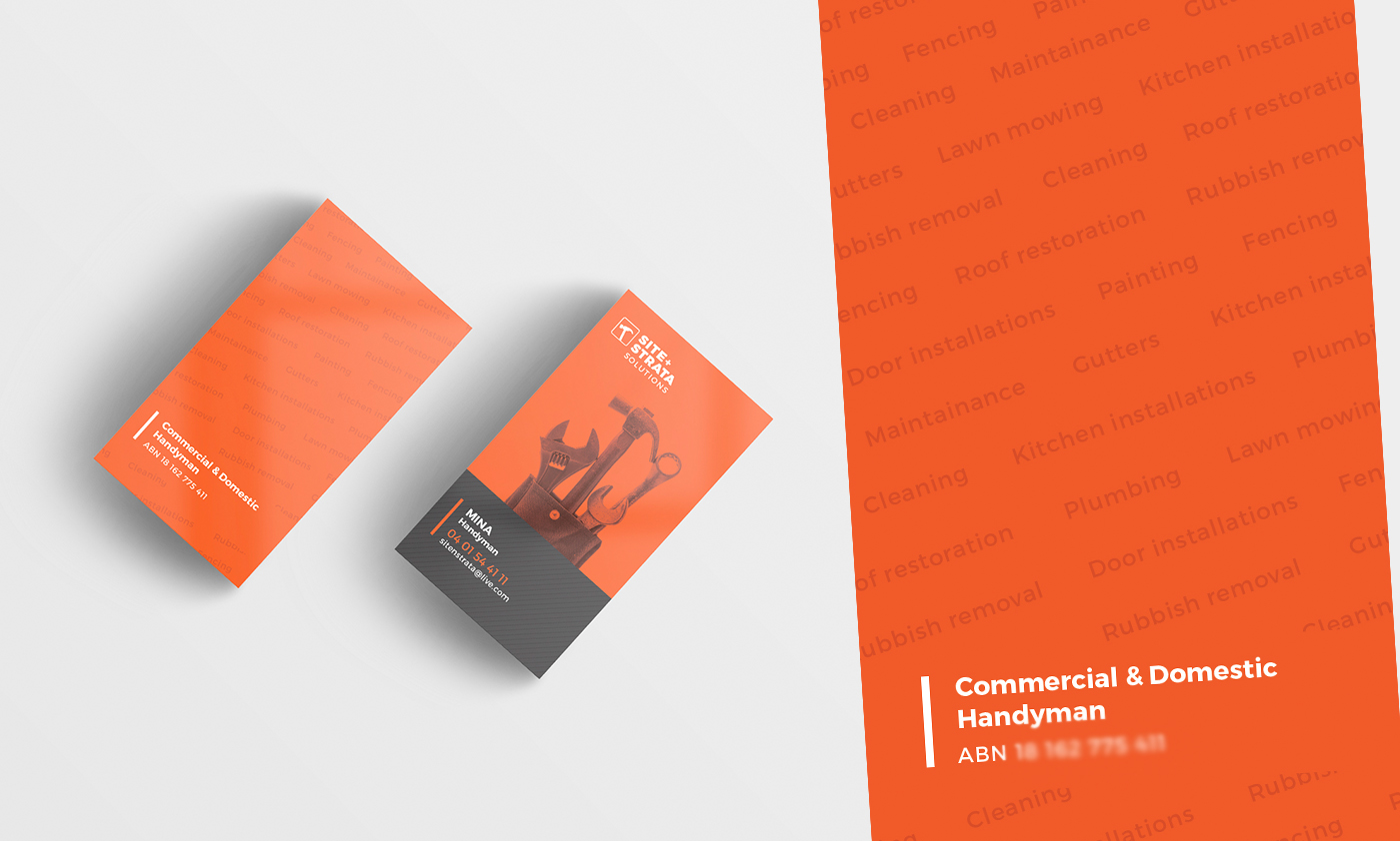
We provided 2 logos and the 3 business card designs below for the wonderful guys at Site & Strata to choose from.
Good Design Is as Little Design as Possible : Less, but better – because it concentrates on the essential aspects, and the products are not burdened with non-essentials. Back to purity, back to simplicity.
